Task 5:Layout and Grids (960 grid)
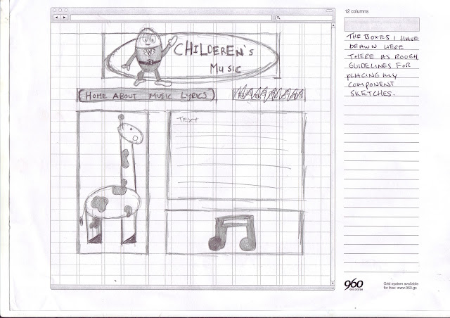
For this task i was asked to mock up page designs using the 12 column grid from the 960 grid template used to design webpages.This task will enable me to consider and use the 960 grid to create a grid based
web design in Photoshop and to create a structure using the 960 grid library.I will take one of the musical themes i have used in the previous examples, and use the musical
theme to develop a web page design using the 12 column grid from the 960 grid layout.I will continue to develop the children's website with the 960 12 column grid.
960 Grid Examples
I have looked at examples of the grid based layout on the 960 grid website
http://960.gs/ some of the examples include:-
This is Hugh Griffith's webpage design using the 960 grid layout with 12 columns, you can see that each of the components to the webpage fit inside the 12 column grid layout .
This is Gantry Framework's webpage design using the 960 grid layout with 12 columns, as you can see again it is using the 12 column layout but in a different manner still each component fits well inside the 12 columns.
This Screen shot is of Sacramento international airport's webpage layout design which uses a 16 column 960 grid layout instead of a 12 column layout, this may be because it needs to fit more onto the page or it wants its components to be bigger.I looked at this page to see what bigger grid layouts looked like aestetically.
Mock up Sketches
Design Sketches
Final design sketch
My mock up page design
My 12 column layout grid design:-
The above image is of my own mock up from my webpages 960 grid 12 column layout design, as you can see it resembles that of the other webpage grid layouts i have looked at as each component fits neatly into the 12 column grid layout.I made this 960 grid 12 column layout webpage design on photoshop by adding each component onto the grid layout then manipulating them to fit within the grid, i think after doing this it looks aesthetically pleasing.
My CSS Trail
As you can see i have made a HTML version of the grid system applied to my webpage, one thing that has changed from my design mock up is the size of the giraffe because i had to fit it into the grid layout of columns 12.I also did not include a working button bar because this was just a trial run of the CSS principles which would be applied to my webpage.Also i changed the design of the header image and made the misspelling more prominent by placing it backwards therefore showing that it is a play on the title as most children cant spell properly because they are still learning.


